Boosting Member Acquisition for Medical Practice
Responsive Web Design for a Concierge (Membership based) Primary Care Office
Product type & year:
Responsive Web Design
2024
Team:
Medical practice marketing team
Membership coordinator
Tools:
Figma
Figjam
Otto.ai
Contributions:
User Interviews
Define
Ideation
Wireframe
Prototyping
User Testing
Iteration
🚀 The Challenge: Bridging the Gap Between Interest in the Practice and Becoming a Member
Northern Virginia Family Practice (NVFP), a concierge primary care provider with over 30 years of service in the DMV area, faced a perplexing issue.
Despite a steady influx of website visitors, the number of completed membership sign-ups was inconsistent and declining. Moreover, the call-to-action (CTA) form intended for prospective members was frequently misused by existing patients, job seekers, and other non-target users.
This misalignment indicated a disconnect between user intentions and website navigation, leading to confusion and missed opportunities for both users and the practice.

Goal: redesign NVFP’s landing page and CTA form to better guide prospective members, reduce confusion, and ultimately increase new member sign-ups.
🕵️♀️ Understanding Users and the Primary Care Needs
To design a landing page that truly serves prospective patients, I first needed to understand what people are really looking for in a primary care provider and where the current site was falling short.
🔍 Competitive Research ( Inova 360, One Medical, MDVIP)
⚠️ Weaknesses Common Themes:
High cost or unclear pricing structures
Less personal attention or overwhelming scale for some users
Limited emergency care or lack of outside-network flexibility
Over-reliance on tech may alienate less tech-savvy users
💪 Strengths Common Themes:
Strong technology integration (especially app-based or digital tools)
Broad accessibility through national or networked locations
Personalized care offerings or advanced wellness services
Established trust through branding or medical network affiliation
💡 Opportunity: Focused on delivering NVFP as a simple and mobile-friendly user experience with clear value proposition, and transparent content that builds trust through personalization and clear pricing.
2. 👥 User Interviews (5 users, aged 22–78, seeking a new primary care physician)
🔑 Key Insights:
Users prioritize convenience: location, availability, and ease of access
Seeing doctors’ faces and credentials builds immediate trust
Transparent insurance info and clearly explained pricing is essential
Many users are open to paying for membership care if it offers more time with doctors and proactive, preventive care
A well-organized, informative, and mobile-friendly site is key to conversion
❌ Frustrations:
Couldn’t find all the information they needed on NVFP or competitor websites
Forms were confusing, unclear, and often misused
Long delays in being contacted after submitting the form
Websites lacked transparency around insurance and pricing
No photos or bios of doctors, making it harder to build trust
3. 🗣️ Internal Stakeholder Research
After speaking with NVFP’s Membership Coordinator, I uncovered a critical friction point in the site experience:
——“People misuse the form all the time. We get questions from current patients, job applicants, and random vendors. It’s frustrating and slows us down.”
🚧 Key Breakdown:
The CTA button ("Become a Member") signaled too much commitment, too soon
Many submissions were not from prospective patients, but from job seekers, vendors, or current patients trying to reach their doctor
Some qualified leads were calling the office directly instead of using the form — showing a lack of trust or clarity in the online process

💡 Insight: The CTA and site structure confused different visitor types, leading to misdirected form submissions and missed opportunities with real prospective members.
🧍♂️ From Insights to Persona: Defining the Real Problem
After synthesizing my research findings, I identified key patterns that helped define the core user and their needs.
I created a persona, Nisreen, to represent my primary user group: busy, health-conscious professionals who want a trustworthy primary care provider but feel frustrated by confusing websites, time constraints, and a lack of accessible information.

This stage gave me a clear direction: users need for a website that reduces friction, builds trust quickly, and guides users clearly through their decision-making process.
💡 Solutions Introduced: Enhancing Clarity, Relevance & Conversion
Before diving into design solutions, I grounded the project in a comprehensive understanding of practice needs—conducting competitive analysis, user and team interviews, and affinity mapping to pinpoint priorities like transparent pricing, provider clarity, and smarter CTA pathways.
These insights shaped clear problem definitions and user flows that ensured the redesigned landing page addressed real user pain points while aligning with business goals.
✅ Problem 1: Visitors can't find the right info when choosing a PCP
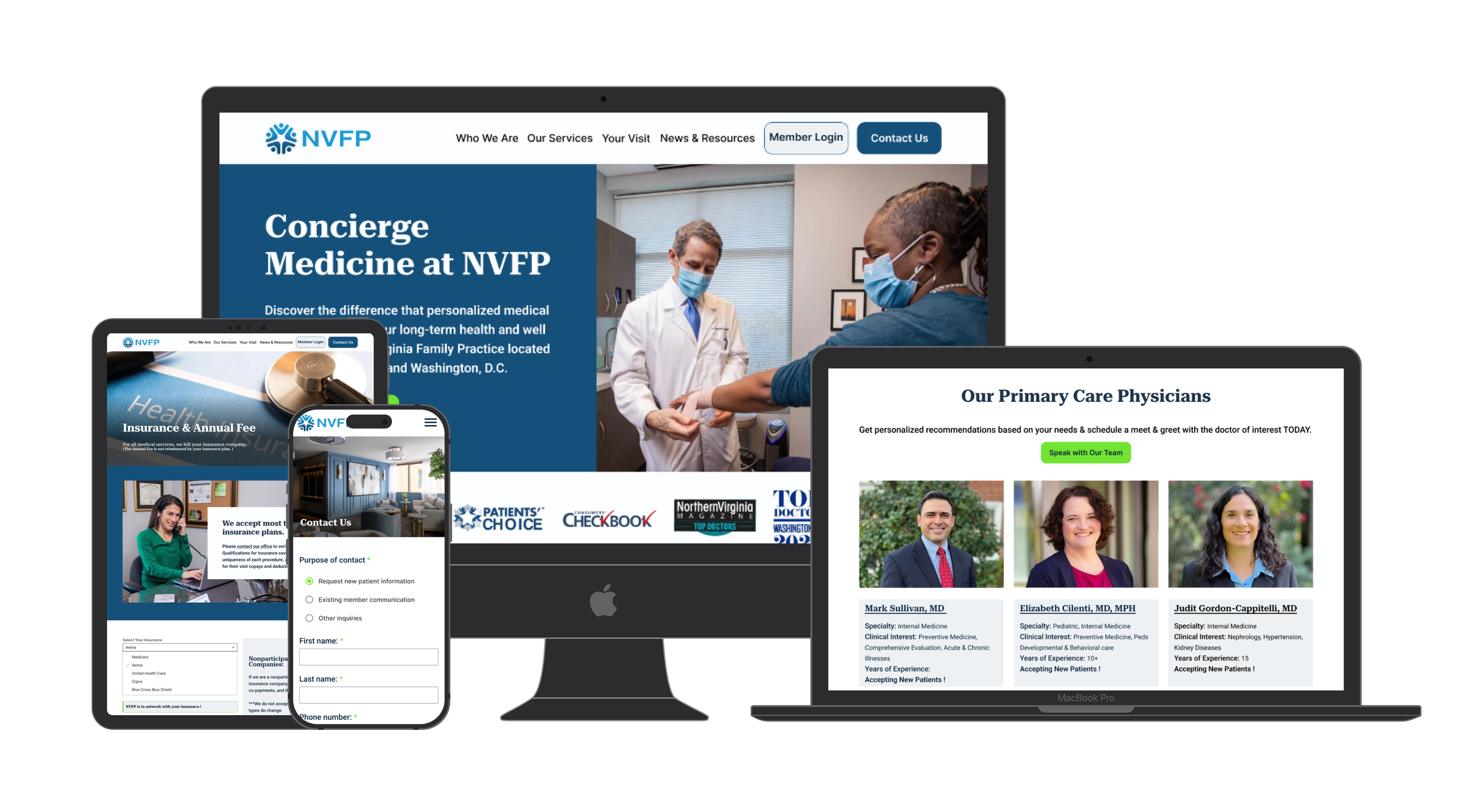
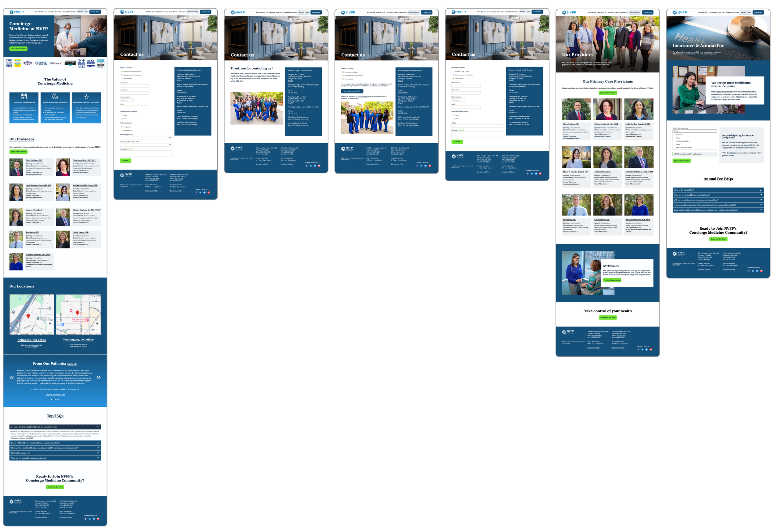
✨ Solution: A Tailored Landing Page for New Patients
Highlights key information upfront: services offered, provider bios, insurance accepted, and pricing
Clearly explains NVFP’s membership model in a friendly, digestible format
Includes trust-building content like doctor photos, testimonials, and FAQs
Offers a soft CTA (“Speak with our team”) to reduce commitment pressure
✅ Problem 2: Users are misusing the CTA form or feeling lost
✨ Solution: Smart Filtering System for the CTA
Replaces a single, catch-all CTA with a simple filter
Dynamically routes each selection to the correct form or page
Improves user experience by creating a sense of personal guidance
Allows for clearer CTA language based on user needs (e.g., “Start Your Journey,” “Contact Your Physician”)
✨ Reimagining First Impressions
After identifying major gaps in how NVFP’s original site communicated with potential patients, I focused on designing a new landing page and call-to-action experience that felt clear, welcoming, and informative.
Every decision was grounded in real user frustrations: unclear navigation, confusing forms, and missing information and guided by the needs of users like Nisreen, who want to quickly understand if a provider is right for them.
This stage was all about refinement: visual hierarchy, tone of voice, responsive layouts, and guided flows. The redesigned experience not only helps potential patients take the right next step, it also reduces administrative burden for NVFP by filtering inquiries more effectively.
🌟 What We Learned & Improved
✅ What Resonated
5/5 users found the landing page clear and comprehensive when searching for a primary care physician.
3/5 users appreciated the provider section, highlighting how clearly it displayed each doctor's specialty, experience, and type.
3/5 users found the Review and Top Questions sections helpful—especially in understanding the annual fee and membership model.
⚠️ Where Users Hesitated
0/5 users clicked the “Schedule Meet & Greet” CTA when prompted to get in touch with a provider.
→ It felt too committal; users preferred a lower-pressure option to simply ask questions or learn more first.1/5 users wanted the full office address shown under the map to better gauge the location’s distance from them.
🔁 What We Refined
Reframed the CTA: Changed "Schedule Meet & Greet" to "Speak with Our Team" for a softer, more inviting tone.
Simplified the layout: Removed duplicate CTAs under each provider and added one centralized button near the provider section.
Improved visibility: Added the full address under the office map.
Enhanced accessibility: Updated button colors to meet accessibility standards.