
Northern Virginia Family Practice
Responsive Web Design for a Concierge (Membership based) Primary Care Medical Office
Product type:
Responsive Web Design
Team:
Partnered with NVFP marketing team, membership coordinator
Tools:
Figma
Figjam
Otto.ai
Contributions:
User Interviews
Define
Ideation
Wireframe
Prototyping User Testing
Iteration
Overview
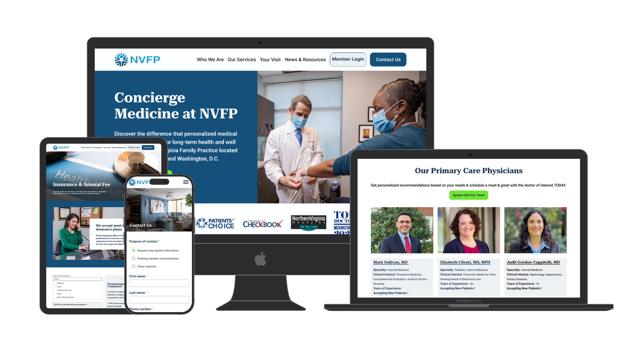
The Northern Virginia Family Practice (NVFP) is an independently owned concierge medical practice serving the DMV area for over 30 years.
Specializing in proactive disease prevention and health maintenance, NVFP operates on a membership-based model, where patients pay an annual fee for personalized care from a dedicated primary care physician.
This project is focused on a series of enhancement of improving user journey and increasing online sign up rate.

The Problem
Since launching its website in 2022, submissions from the call-to-action button have been inconsistent and have steadily declined.
Additionally, incorrect submissions are being made by existing members or individuals who are not seeking to become members.

My goal is to design a landing page for NVFP which offers essential information for those seeking a primary care physician. The updated design of the call-to-action form simplifies the user experience and guides prospective patients to the appropriate page. These improvements are likely to result in higher sign-up rates for the practice.


User Research
Competitive Analysis
I compared 3 other most popular Concierge primary care practices ( Inova 360 Concierge Medicine, One Medical, MDVIP) in the northern Virginia DC area along with Northern Virginia Family Practice to analyze their strengths, weaknesses, features and pricing.

My opportunities :
Ensure a clear value proposition that explains why NVFP is the best choice.Focus on simplicity and usability with easy navigation and CTAs.Make the page highly responsive and mobile-friendly.Add personalization and detailed pricing information to improve clarity and trust.
2. User Interview
I interviewed 5 people who are currently looking for or recently found a new primary care physician between the ages 22 to 78 (3 females, 2 males) and it helped me gather qualitative insights that can shape the app’s features, design, and overall user experience.
Research Goal:
Understand the process of finding a PCP
Understand potential patients’ sign up process of the NVFP Website.
Learn the user experience of the website, what they liked or disliked.
After conducting user interviews, I put all the info I gathered into an affinity map in order to help organize and synthesize insights gathered during the interviews to identify patterns, themes, and actionable takeaways.

Insight:
When choosing a primary care physician, patients prioritize a convenient location, availability & accessibility, positive reviews, qualified doctors with relevant experience and specialties, transparency about insurance, and the ability to see the doctors' faces on the website to build trust.
People found that they couldn't easily find all the information they were looking for on NVFP’s or other practices’ websites when selecting a PCP. They felt the website was somewhat confusing, and the form was unclear. Even after completing the form, they experienced delays in being contacted.
People are open to paying for membership-based practices when they have the financial means and value the increased accessibility. An increasing number of younger individuals are becoming more proactive about their health, seeking more time with their doctors to discuss their concerns and actively engage in preventive care.
3. Team Member Interview
After speaking with NVFP's membership coordinator, I learned that the CTA button form submissions are not always from prospective members. Sometimes, they come from current members trying to contact their physician, individuals seeking business opportunities, or other doctors interested in joining the team.
This made me realize that the current website isn’t effectively guiding visitors to the right places, and that those who need to fill out the form are instead calling directly. The wording of the CTA button, "Become a Member," may be signaling too much commitment too early, and it should be revised immediately.


Define
The competitive analysis and user interviews gave me a better understanding of who the users were and what they are looking for when selecting a primary care physician. I focused on expanding those findings into concrete visualizations that would help me empathize with users, design the landing page & CTA, as well as guiding them to the correct destination.
User Persona
Understanding the user perspective, we created the persona ( Nisreen) to help us move forward with our decision-making.

POV/ HMW
I’d like to explore way to help potential patients find out more information about NVFP when they are interested in possibly selecting a primary care physician here because not everything they are looking for is presented right when they first get to NVFP’s website.
How might we help potential patients find out more information about NVFP when the site has so much information but not necessary what the patients prioritize when selecting a primary care physicianSolution: Landing page that contains all the necessary info that someone who’s looking for a pcp might needI’d like to explore ways to guide NVFP site visitors to the appropriate page wether it be them looking to get more information on the practice, speak to their own doctors, or have other inquiries because incorrect submissions through the CTA button form are being made.
How might we guide NVFP site visitors to the appropriate page when the website is confusing and there is no clear direction of where they need to go?Solution: Filtering system to help guide where to go
Idealtion
User Flow
User’s primary path within NVFP's landing page includes existing member locating the patient portal, potential patients filling out the meet and greet form and other inquiries are directed to the appropriate contact points for easy communication.
Site Map

I designed the landing page to include all essential information for potential patients when selecting a primary care physician. I also renamed the 'Patient Portal' to 'Member Login' to better reflect the action of logging in and to clarify that it’s for existing members. Additionally, I ensured that even if users end up on the 'Contact Us' form, they are still redirected to the patient portal on the subsequent page.

Mid Fidelity Wireframes
I created mid-fidelity wireframes to validate key concepts and functionalities, aiming to incorporate all the essential elements potential patients typically look for when selecting a new primary care provider.
Based on insights gathered from the Membership coordinator, I revised the CTA button to accurately represent the expectation of the next step which is to get more information and set up a meet and greet with provider of interest, but I'm unsure if this fully addressed the navigation issue for visitors. It became clear that a more effective filtering system was needed to guide users to the right areas of the site.

High Fidelity Wireframes
In the high-fidelity wireframes, I refined the layouts and made adjustments, including adding auto-layout for a more uniform and aligned design.
I implemented a filtering system on the "Contact Us" and "Schedule Meet and Greet" pages to ensure that, even if existing members missed the patient portal button on the landing page, they could easily find the correct section. This improvement eliminates the risk of incorrect submissions.

Protype & Test
Usability Testing
I did 5 usability testing with potential users between ages 22 to 62 and it helped me to identify usability issues and gather insight on user behavior, preferences, and challenges while interacting with the app.
0/5 people selected the new CTA button “Schedule meet and greet” when asked where would they go if they want to get in touch and potentially talk to a provider of interest. They mentioned that it felt too much like a commitment; they simply wanted to speak with someone and gather more information first.
5/5 people thought felt they were able to find all the information they needed when searching for a primary care physician on the landing page and couldn't think of anything else to add.
3/5 people appreciated the clarity of the provider section, which clearly displays their specialties, years of experience, and types of doctors.
1/5 people suggested that the full address be included below the map, so they can easily determine the exact distance from where they are coming from.
3/5 people appreciated the review section and the 'Top Questions' section, which explains how the annual fee and membership work.
Iteration
Changed CTA button “Schedule Meet & Greet” to “Speak with Our Team”
Added full address below office locations
Instead of having “Schedule Meet & Greet” under each provider, only one CTA button is located by the provider section.
Updated button colors so it’s accessible
Conclusion
NVFP’s landing page resonated with users like my user persona- and they could see it being useful in helping them to find a new primary care physician
If I had more time, I would have completed few more usability tests to better my iteration as well as user interviews in my research phase.
I enjoy working with (and contributing to) a design system. Greatly sped up my high fidelity process!
During this project, I learned the importance of truly listening to testers' feedback. Sometimes, what the designer believes will work may not align with how users perceive it.

